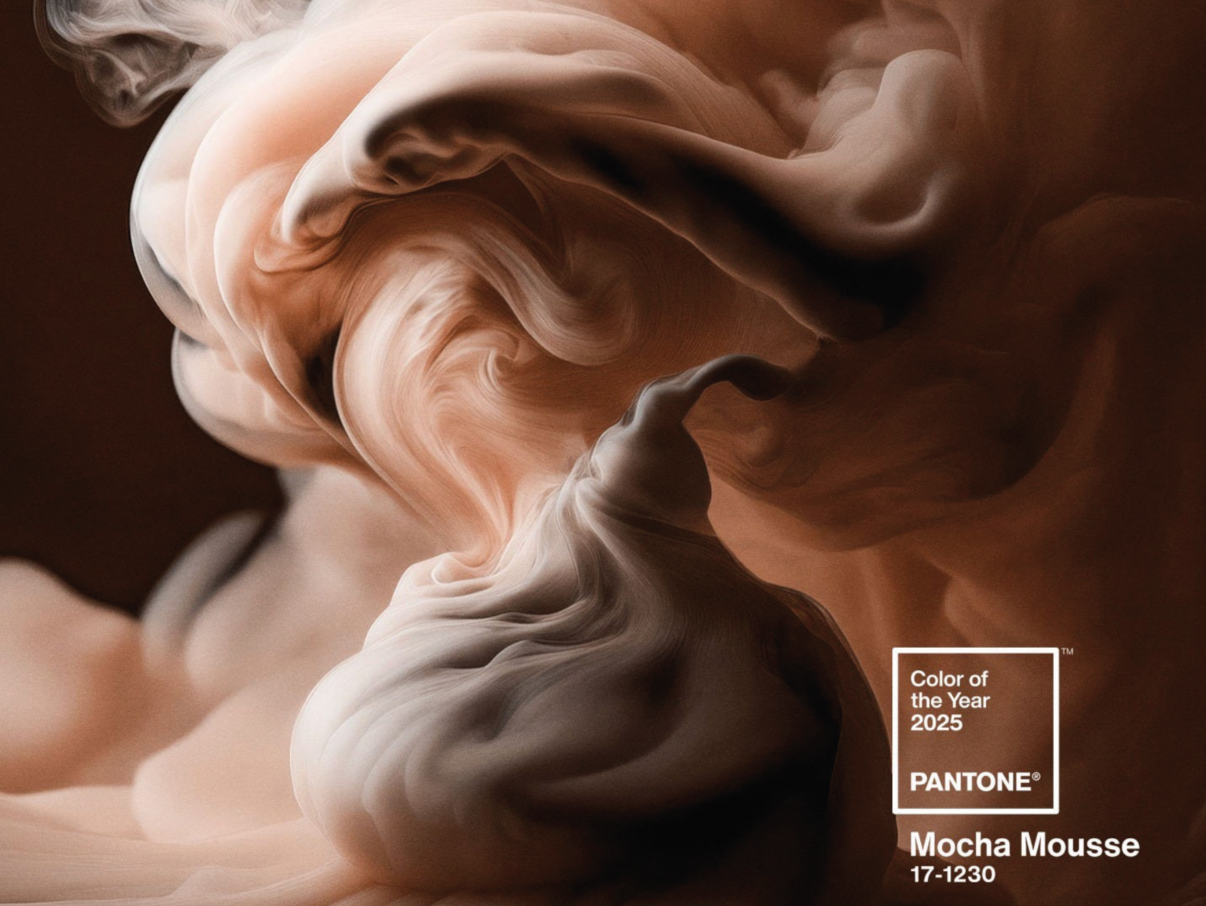
Whether it’s the nurturing aspects of Pantone’s Mocha Mousse, chosen as their 2025 Colour of The Year or the uplifting hue of True Joy selected by Dulux as their colour for 2025, there is a common theme that we will want our homes to be our sanctuary for optimism.
More than 10 million designers and producers around the world rely on Pantone Products and Services to help define, communicate, and control colour from inspiration to realisation
This year’s shade reflects the overwhelming need for comfort felt across the globe. Pantone 17-1320 Mocha Mousse is a versatile shade infused with inherent sophistication and earthy refinement which creates a strong chromatic foundation.
Pantone’s executive director Leatrice Eiseman
explains how the decision was “underpinned by our desire for everyday pleasures, Pantone 17-1230 Mocha Mousse expresses a level of thoughtful indulgence. Sophisticated and lush, yet at the same time an unpretentious classic, Mocha Mousse extends our perceptions of the browns from being humble and grounded to embrace aspirational and luxe.”
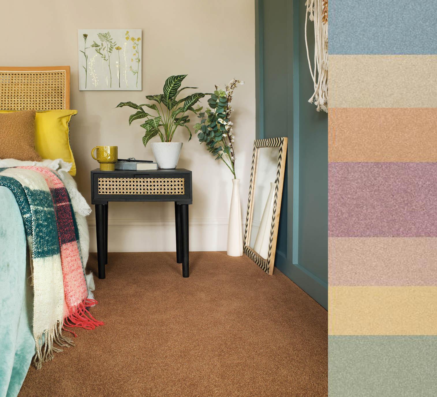
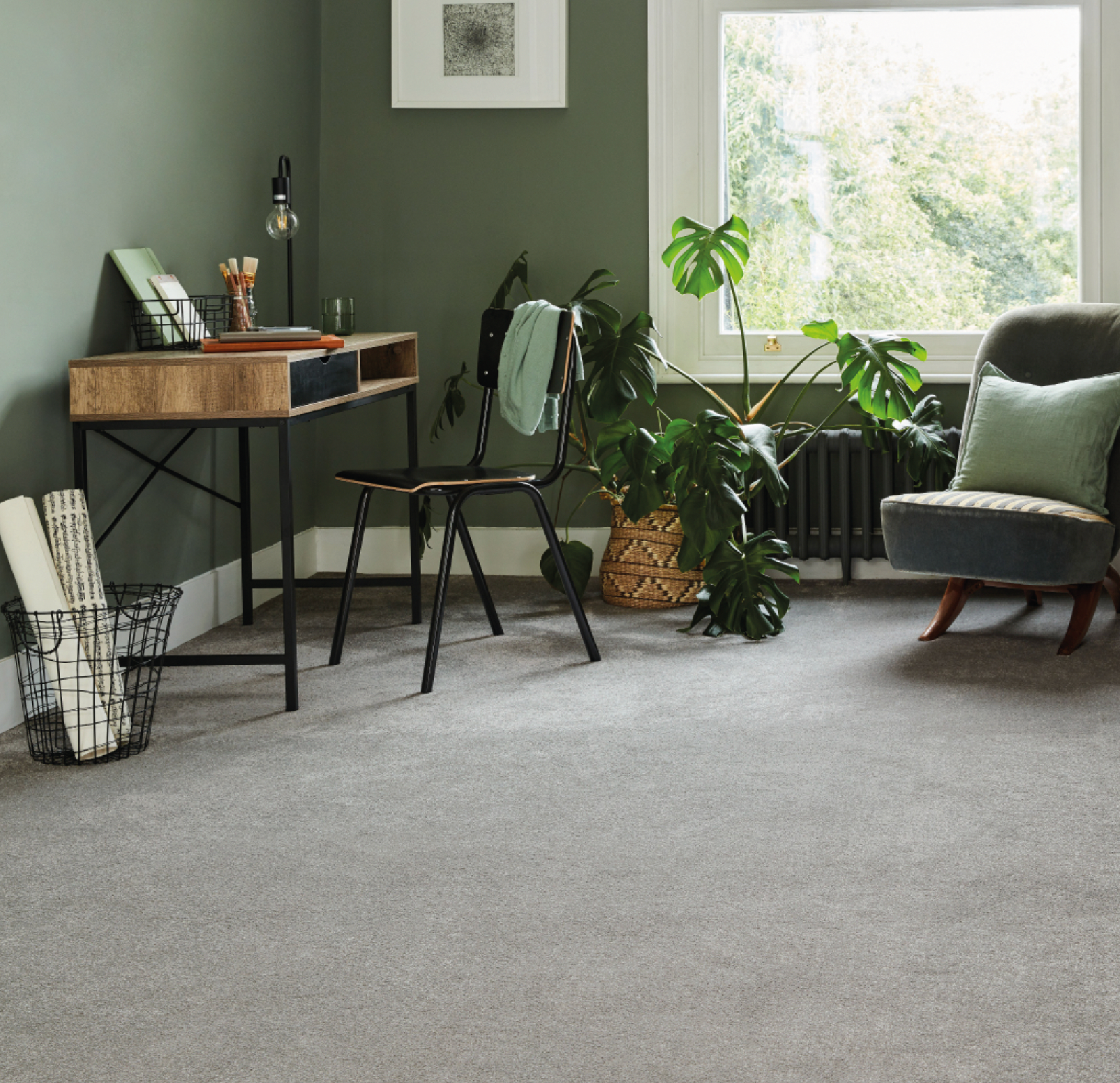
Wellbeing is at the heart of the latest interior trends, particularly the health benefits of bringing natural beauty into the home. Interior designers are increasingly using bold yet serene earthy tones, from the soft browns of oatmeal and caramel to the cocooning effect of warm coral and rich blues and greens.
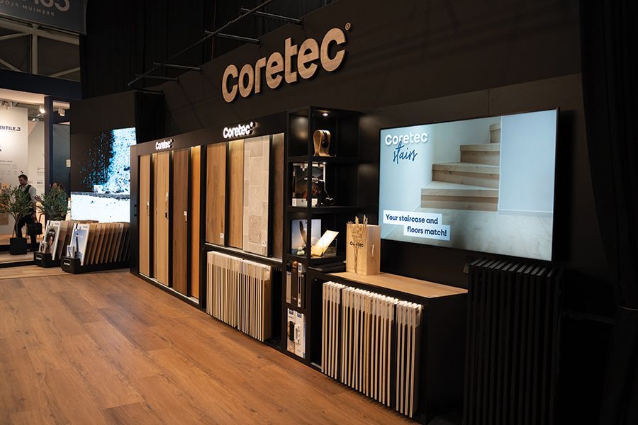
Richard Allen, sales director at
Karndean Designflooring, said: “Chances are you’ve heard of Elephant’s Breath, perhaps in part for its affectionate name, but most likely because this is one of Farrow & Ball’s most popular mid-toned neutrals, no doubt due to its versatility and ability to morph in different lights and colour pairings.
“Available in a rigid core format for uneven subfloors and a herringbone size for interesting laying patterns, Lime Washed Oak is an affordable favourite that’s unlikely to fade anytime soon.”
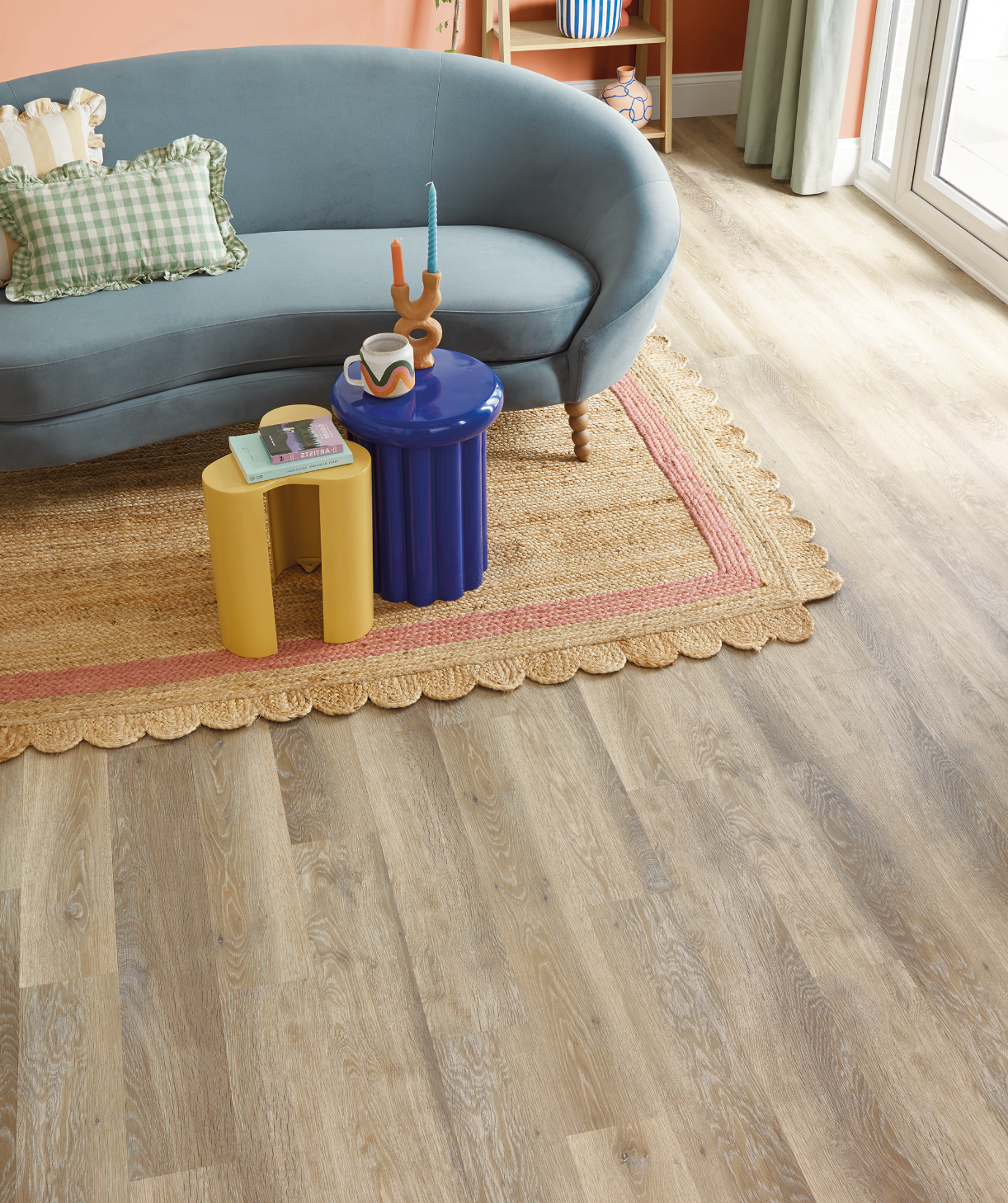
“So, it probably comes as no surprise that Lime Washed Oak from our Knight Tile collection is our best-selling design heading into 2025. With its combination of warm beige and cool grey tones and the texture of worn, sun-bleached driftwood, this is an extremely adaptable design that will complement and enhance a wide range of nature inspired colour palettes. Available in a rigid core format for uneven subfloors and a herringbone size for interesting laying patterns, Lime Washed Oak is an affordable favourite that’s unlikely to fade anytime soon.
“Those looking for similar mid-toned oak designs might also consider three alternatives that have been greatly loved by our customers over the past year and we predict will join our bestseller list; Aviemore Oak and Hayfield Oak from our dual format Van Gogh range and Dove Artisan Oak from our new Art Select collection.”
The 2025 interior design trends embrace bold hues, timeless neutrals, and rich textures, creating stylish and inviting spaces.
Cormar Carpets’ diverse product ranges are perfectly positioned to help retailers meet consumer needs.
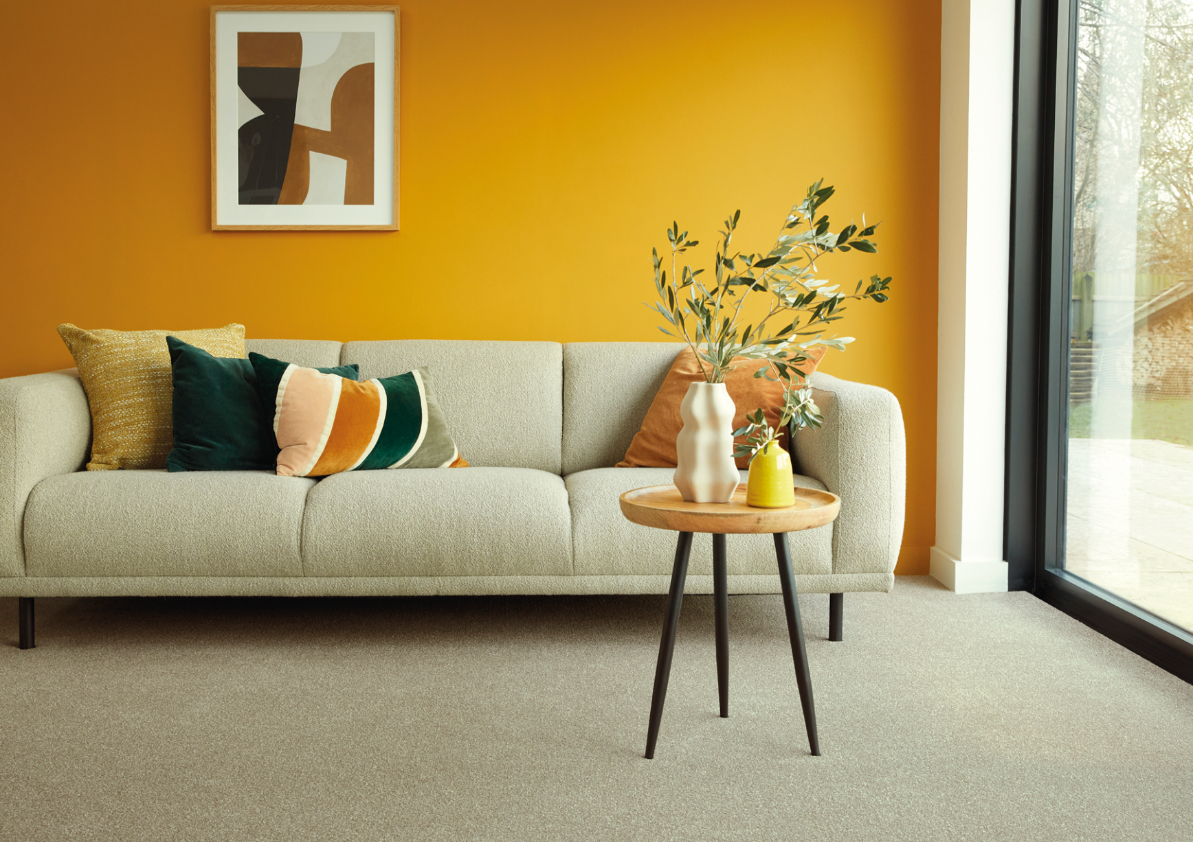
Leading the way is Dulux’s Colour of the Year, “True Joy,” a warm, optimistic yellow that pairs beautifully with emerald greens or muted yellows for a vibrant touch. Deep, moody tones like rich brown and smoky grey are also gaining popularity, adding drama and cosiness. Cormar’s new easy clean Zenith range captures this sophistication within its diverse colour palette, while offering a practical option suitable for all around the home.
Nature-inspired neutrals remain key, with shades like rich creams and earthy tones creating a grounding backdrop that complements brighter accents. Cormar’s durable wool loop ranges provide style and resilience, perfect for busy homes. Textured carpets in natural shades, like those in the Fairisle and Malabar Two Fold ranges, add depth and demonstrate how layered neutrals create harmony.
With vibrant colours, timeless textures, and sustainable materials,
2025’s trends celebrate joy, depth, and style, offering endless ways to transform interiors.
For Clare Jenkinson and Calvin Pope, residential designers at
Ulster Carpets, there is a feeling that 2025 will bring a shift towards more colour again. Calvin said “In recent years, colour palettes have been based around a bank of greys and a more neutral base. There has now been a definite shift towards colour, but the natural feel remains.”
Clare agrees adding,
“Colour trends in the last few years have been focused on earthy neutrals but for 2025 there is a clear move towards rich, warmer colours. The love of warm, cozy interiors is still very much evident too and that is why wool-rich carpets remain so popular.”
This shift is very much in play in the new additions to the Croft and Strönd designs in Habitüs. Remaining true to the quiet, understated aesthetic of Danish interiors, the 6 new additions continue the theme of belonging with nature, adding a warmer feel to the existing collection.
In the Croft range, Roe, Wicker, Marram and Orchard offer a natural, textured finish that conjures feelings of cosiness and comfort. For Strönd, the contrasting ribbed design of Fallow and Fjord balance a clean, calm combination of plain and heathered yarn with a contemporary aesthetic. Part of the 100% wool Habitüs collection, Strönd Fallow (pictured) mimics the colours of sandy soil found near the coastline and the warm and light colours of a Fallow Deer.
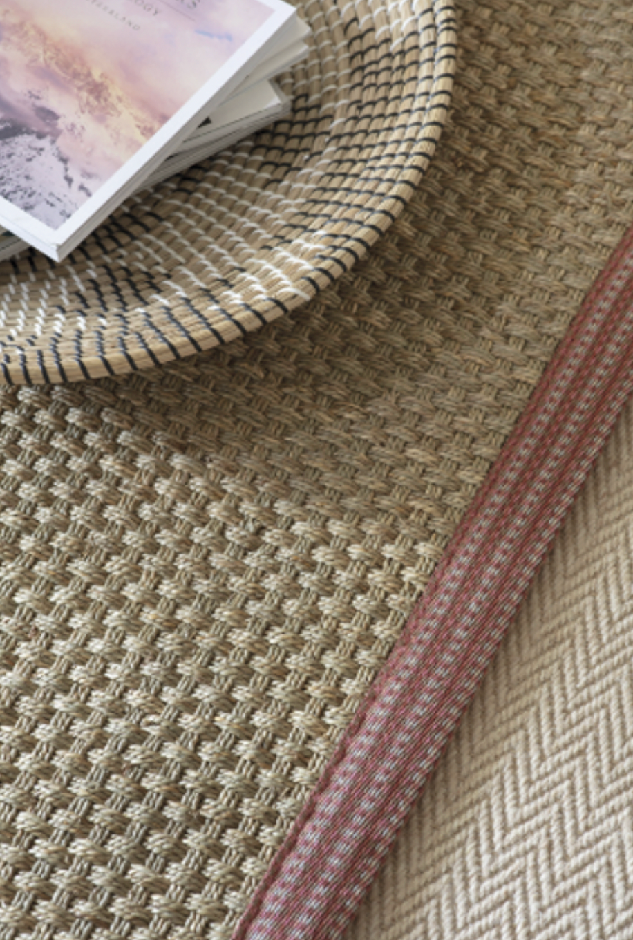
Pictured above: Alternative - Seagrass Balmoral Basketweave rug with a Blur Pinku Border.
To add a hint of colour and cosy texture, explore Alternative’s
‘Make Me a Rug’ service to design a bespoke rug inspired by the whimsical hues of heather.
To celebrate the natural world, embrace the beauty of natural fibres - choose from, seagrass, coir, sisal, and jute and compliment the rug with an eco-friendly ‘Studio Border’, which has been expertly hand-dyed in Scotland and crafted in the Hereford studio by textile artisan Ray Poole. Finish with a border in soothing tones of pink or warm berry, such as Blur Pinku Border to complete the look.
Kelly Butler, head of design at
Adam Carpets said, “Truffle brown has crept up slowly on the heels of the warming neutrals like flax, oat milk and greige. Truffle complements a range of styles, modern minimalism, rustic chic and layers beautifully with a broad palette of colours from soft neutral hues to deep bold palette, elevating the style of any space.”
Etsy online retailer commented that these earthy tones are already beginning to pop across a wide range of categories in the retail world. From wooden ornaments, wall art and textiles. Consumers are embracing these colours in all aspects of their homes that showcase relaxing creativity and cocooning themselves away from the outside world.
Kelly adds
“Cool Matcha is also a trending colour of 2025. It represents a calming and refreshing shade inspired by the serene hues of traditional Japanese tea. Combining subtle greens with hints of blue, Cool Matcha creates a sophisticated and soothing tone.”
This versatile colour palette reflects balance, tranquillity and natural beauty, making it suitable for interior design and product development. Its contemporary yet timeless appeal captivates and inspires consumers with its harmonious and cool-toned aesthetic.
Kelly also highlights bubble tea’s cultural influence extending
beyond taste. She explains,
“Bubble tea has become a cultural icon, representing the fusion of tradition and modern flavours. Its global appeal lies in the joy it brings. It offers a feast for the eyes, with social media playing a significant role in boosting its appeal with creative designs featuring layer colours and ombre effects.”
“When searching colour trends for the following year, I find that the Decorex Show in October is invaluable,” says Eamonn Prescott of Greendale and iD.
“This year there were the expected warmer tones and neutrals, but also a welcome amount of green, a colour we have seen resurging over the last twelve months. These tones have a hint of grey and will work well with many of our collections from most suppliers. We believe these calming hues of Autumn will remain popular.”
ReColour cork flooring by
Granorte redefines interiors by combining the natural beauty of cork with a vibrant palette of colours, offering a refreshing twist on a classic material. The essence of cork remains at the heart of ReColour, with its texture and character accentuated by carefully chosen hues. This innovation marries the aesthetic appeal of cork with exceptional performance, making it a standout choice for both residential and commercial spaces.
Designed to meet diverse needs ReColour offers floating Uniclic panels or glue-down tiles, available in 28 captivating colours. The WearPlus super-matt finish, enhanced with CleanSurface technology powered by Microban, ensures a durable, antimicrobial surface. Comfort and acoustics are elevated by an integrated CleanCork underlay with Microban protection, making these floors as practical as they are beautiful.
Sustainability is woven into every aspect, with ReColour made from over 80% renewable materials, low in VOC emissions, and compliant with GreenGuard Gold and other stringent certifications. Crafted by Granorte, a company with over 53 years of expertise and a commitment to eco-conscious innovation, these floors embody quality and craftsmanship. Headquartered in Telford, Granorte UK Ltd, offers a range of solutions tailored to local markets.
Join the online community on:
facebook.com twitter.com pinterest.com
instagram.com youtube.com houzz.com